reportedly, i have a good repoire with colors.
it has always been a gift.
they are like words and they flow as crazily or with control as i can enjoy.
i really love them a lot.
when i was a kid, my mom bought wall to wall carpeting that was rust colored.
then she and my stepdad purchased a set of olive green flocked furniture.
they were used in a room that my mom wanted to call the "Jamaica Room".
it overlooked Long Island Sound from our northern side of the house.
i was prone in those days to take my life in my hands with these irrepressibly romantic parents.
my sensibilities included calling things what they were.
in the household real estate program, my practical nature called the space,"the new room".
in the household real estate program, my practical nature called the space,"the new room".
it had been renovated by my stepfather and some of his friends(i think).
there were contemporary white, boxy walls...
antique sea chests my folks collected,
an old glass encased wooden ship model,
a brick faced fireplace,
antique sea chests my folks collected,
an old glass encased wooden ship model,
a brick faced fireplace,
the unmentionable brick and green soft furnishings
and three insanely wound up children.
my folks were trying to be practical in terms of their living surfaces and dirt.
unfortunately, brick, olive and white do not speak to me of Jamaica.
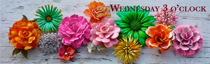
to me that includes cerulean blues,
pale sunbleached colors
and pops of wildly bright fun colors.
all of them found in the lively homes and
flora of the magnificent isle and surrounding waters.
pale sunbleached colors
and pops of wildly bright fun colors.
all of them found in the lively homes and
flora of the magnificent isle and surrounding waters.
nope, no matter what they wanted to call that room, it stayed for all purposes tattooed
with the name, the NEW room.
somehow practical and obvious just sticks no matter how hard you wish for something else.
that was an early entree into the world of interior development.
actually pulling paint chips,
looking at
actually pulling paint chips,
looking at
real life carpet samples and other perks of the renovators world hooked me.
i carried a paint chip for years in my purse throughout my high school years
its color was "Ice Floe".
i wanted my room that color so badly, i could taste it.
really, i could.
it was a much paler tone of a mint chip ice cream without the yummy chocolate bits.
eventually, a need to repair and insulate the walls of my part of the house
allowed for a drywall installation and a beloved paint job.
eventually, a need to repair and insulate the walls of my part of the house
allowed for a drywall installation and a beloved paint job.
many more things have happened since that satisfying change to my teenaged environment
(cave of adolescence.)
my nascent color sensibilities could actually be used.
(cave of adolescence.)
my nascent color sensibilities could actually be used.
i actually was sought often to select a color or two in one for friends
and even some professional occasions.
and even some professional occasions.
i had by then gone to architecture school
and had finally passed the licensing exam allowing me to call myself an architect.
and had finally passed the licensing exam allowing me to call myself an architect.
i stubbornly stuck with that line of work as long as i could.
not that i wasn't good at it,
but i was a bit impatient and the timing was off.
but i was a bit impatient and the timing was off.
finally i had found a niche for some of my skills.
i needed to put it on hold, as i began to have my children.
i always felt as if on the edge of some abyss.
i never had a sense of being a real live architect.
i practiced in both small and large offices.
my color sensibilities were called upon to help refine spaces being built or renovated.
one of the very large offices i suffered through working in,
my color sensibilities were called upon to help refine spaces being built or renovated.
one of the very large offices i suffered through working in,
had an atrial space that rose 5 stories inside a skyscraper in boston.
the project manager/owner
asked me to apply myself to the task of selecting colors for the space.
the project manager/owner
asked me to apply myself to the task of selecting colors for the space.
my idea of a neutral was an almost impossibly subtle shade that had a hinting rosy quality to it.
my error.
in this work place
in this work place
everything should always have been grey.
any suitably subtle tone would have worked
with the modern interpretations of moroccan screens
created for every imaginable level in that building.
with the modern interpretations of moroccan screens
created for every imaginable level in that building.
i romanticized that many hued sunrises and sunsets could arc in their paths
over that impossibly huge expanse of a white wall.
on rainy days, it would exude a hit or warmth;
sunny summery air conditioned days, it would allow for a sense of being outside in the world.
over that impossibly huge expanse of a white wall.
on rainy days, it would exude a hit or warmth;
sunny summery air conditioned days, it would allow for a sense of being outside in the world.
i imagined that there would be a warmer feel in the space,
in spite of its cold office application.
in spite of its cold office application.
i was unceremoniously dumped by that office shortly after my foray into the unexpected world
that interiors offered.
it just wasn't part of their skill set
that interiors offered.
it just wasn't part of their skill set
and they just had no idea what to do with me.
i guess i never gave them any reason to investigate.
when my mr. and i moved to providence,
he thought having a red living room was the bees knees.
he thought having a red living room was the bees knees.
so he painted a base layer of deep rosy copper primer
and i went at the surface of the walls with an old tee shirt and some red toned paint
while halley napped.
and i went at the surface of the walls with an old tee shirt and some red toned paint
while halley napped.
i mixed too little of the paint to rag onto our walls
and wound up with one wall completely different than the other,
but i also feathered all the colors together so it has never been noticed.
and wound up with one wall completely different than the other,
but i also feathered all the colors together so it has never been noticed.
this may have been twenty years ago and it remains as warm and interesting a finish as any.
it is on the north side of the house,
it looks like the room is aflame each night when our lights are turned on.
it looks like the room is aflame each night when our lights are turned on.
it is saturated and still pretty damn daring.
it is home.
i skip all around in this love ode to color and applications.
leapfrogging from one time to another.
each time,
each time,
i seemingly alight upon some other saturated color palette.
it is not within my ability
to squash and repress my love for the rainbow expressions of light in my life.
to squash and repress my love for the rainbow expressions of light in my life.
so pray tell me?
someone?
anyone?
why do i love pale, nearly white and mixed white colors so much.
i feel as if i am cheating on my own fully hued loves.
i am torn i tell you!
i must say though.
in fairness to all of this and the dilemma i find myself in,
since i work in jewelry these days,
i can switch around and fuss away in different color-ways as fluidly as i care to.
no one holds me to any one thing.
if i feel some stuff coming on some days, i try to chase it.
things have a way of working out somehow.
things have a way of working out somehow.
calming notes or wild giggly flamboyance are dramatically tap dancing through my heart.
i love it all.
it is played with both as a function of what i call "my art"
in jewelry expressed gardens,
as well as
in custom requested visions of some of my clients.
it feels like delicious food rolling around in my mouth.
so toothsome, i can eat it all up.
also visually, it is a little provocative as it is worn.
the model for these expressions definitely gets noticed in a crowd.
the model for these expressions definitely gets noticed in a crowd.
no one can pass a garden on a neck without a comment about it.
tonight i enjoyed a small selling venue.
it was at my friends Pernilla and Line's store,
KREATELIER.

it was at my friends Pernilla and Line's store,
KREATELIER.

i had an invested client/ parent of a friend of my daughter's
visit for a refresher on a necklace.
visit for a refresher on a necklace.
it had been purchased years ago and worn so very regularly that it finally took a nose dive.
i will gratefully rebuild this piece for my friend.
it should be noted that she did not want anything with any color in it.
she did not want any flowers to wear on her neck.
she walked away with her husband buying a very quirkily colored necklace of flowers.


she is a lawyer.
she currently sports a very full head of short salt and pepper curly hair.
she will be rocking this
sandy brown, raspberry red, white, and aqua flower necklace after the holidays.
sandy brown, raspberry red, white, and aqua flower necklace after the holidays.
its nearly neutral tones with a little bit O'Sparkle,
will be making her sit a little bit out of her usual comfort zone
and yet with a subtle introduction of shots of unexpected color.
she really can do it. she has the personality to do it easily.
even if she is a lawyer.
she looks an awful lot like an artist, even if she is unaware of it some days.
i love how i get to play into lives this way
with my quirky color theories.
this is a necklace for a woman that requested
a group of dissimilar shaped and hued blooms.
a group of dissimilar shaped and hued blooms.
i was having a hard time with it.
and then i injected black.
she pointed out that she is an interior designer.
i get that!
it feels like a road trip right back to a set of my roots,
the architectural ones.
here is how her suggestions morphed along.
she liked some of each of these three necklaces:
"FARMSTAND GLORYVII"

"COTSWOLD II"

and another earlier incarnation of a
"FARMSTAND GLORY"

these all added up to:
"KRISTENE'S NECKLACE"

i still have some other bits of drapery to add to this...but that is a morning light task.
{when the light returns, and it is the better to see it with. }
also just to remind you of how color shock therapy has been in play recently,
his was my piece for the
"DAY OF THE DEAD"
necklace...
called
" TWENTY FLOWERS for CATRINA"

both of these intensely colored pieces were created after i made this
very white and subtle necklace.
"VICTORIAN SENSIBILITY"

lest you think that no woman right in her mind can make this come alive,
take a look at Kara in this.
it looked to me as if i made it for her and her alone.
tell me that they are not organically intertwined?
i think they look like an ivy league college building with gorgeous ivy attached.
classical. plain. and. simple.
{the photo does not do justice to how alive kara looks generally.
you get what you deserve with a point and click camera... so sorry...}
you get what you deserve with a point and click camera... so sorry...}

so i am gonna wrap up this wildly long post on my colorized life tonight and
do the dishes before i turn into a pumpkin.
xo.
W.

No comments:
Post a Comment